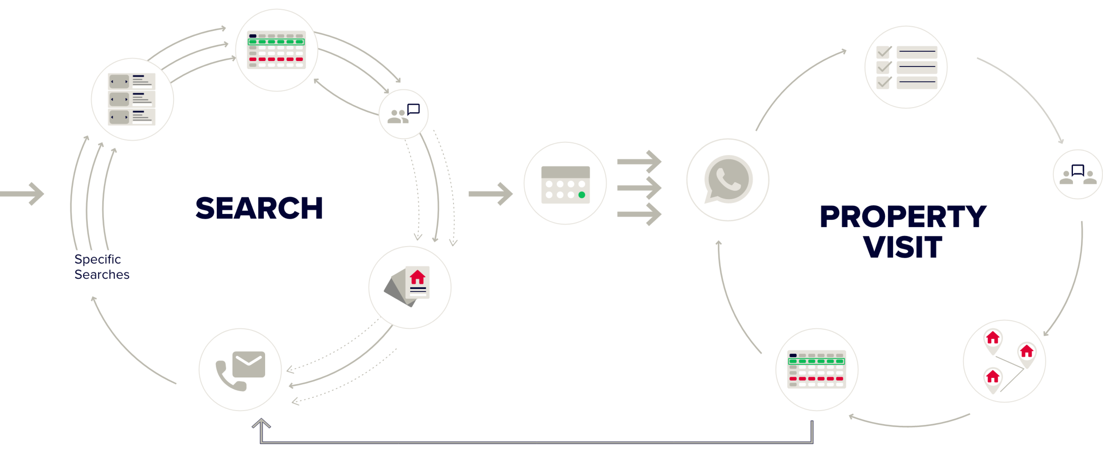
The process
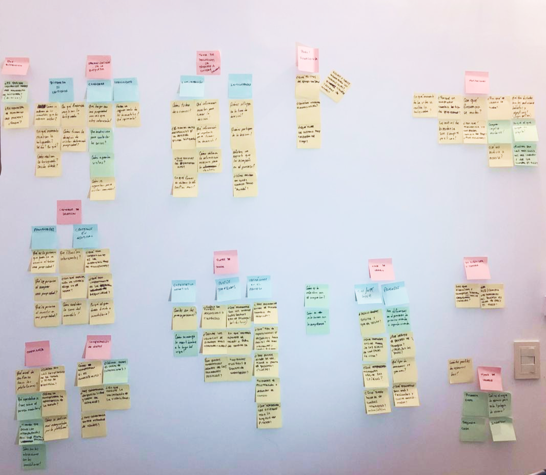
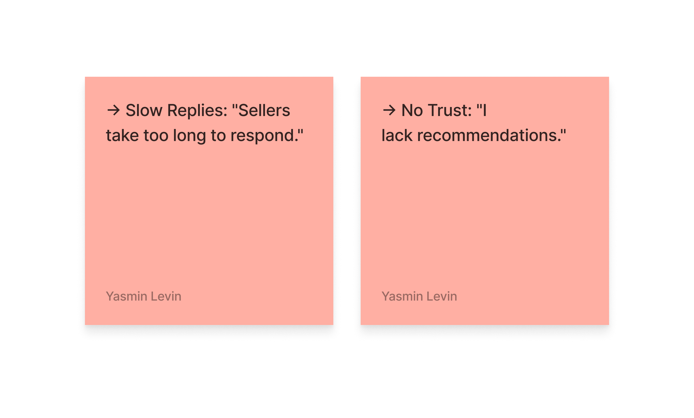
The process included 3 stages, with the first stage being particularly exhausting due to numerous gaps in the journey.
Stage 01 -
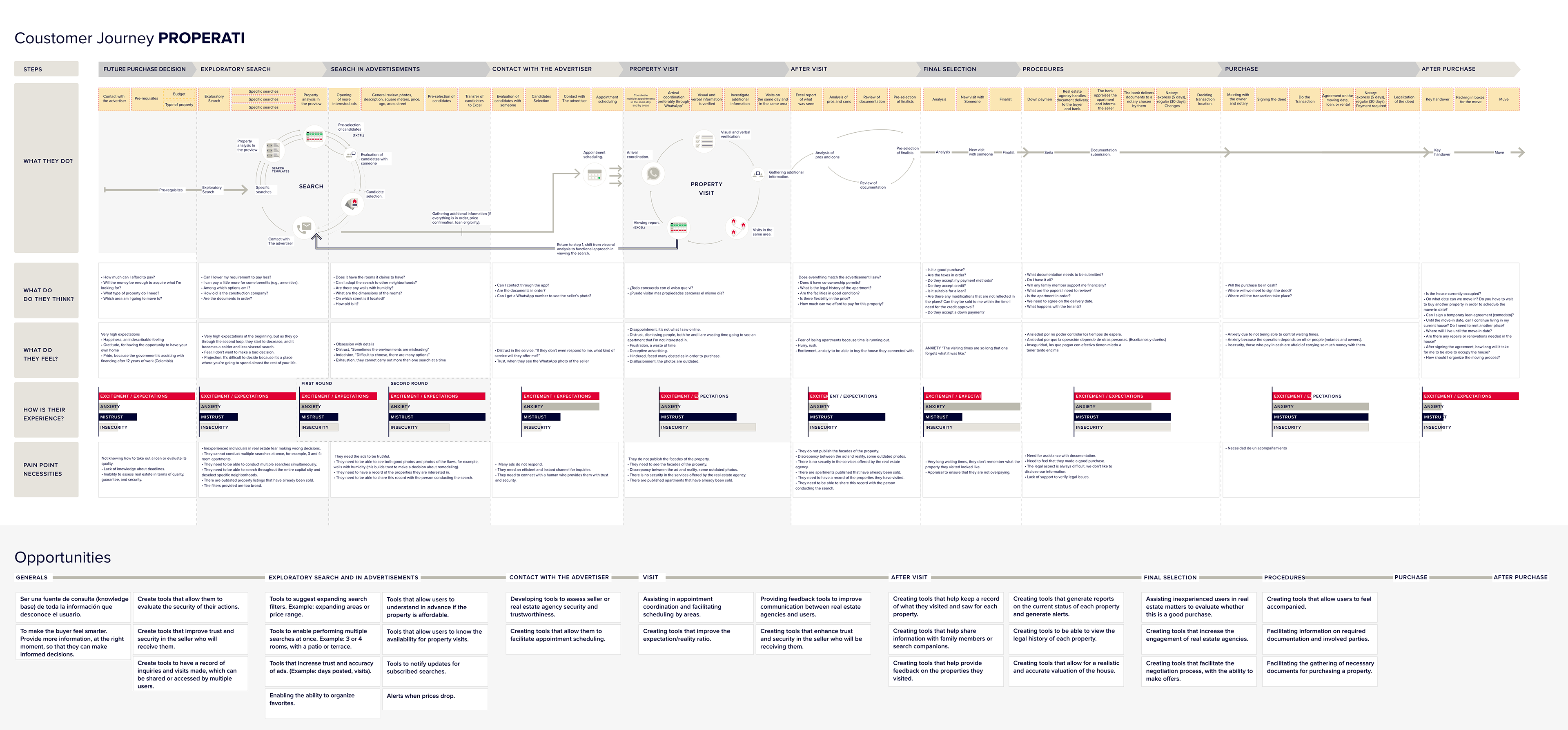
Research & Discovery
• Buyer Analysis: personas
• Journey, opportunities
Stage 02 -
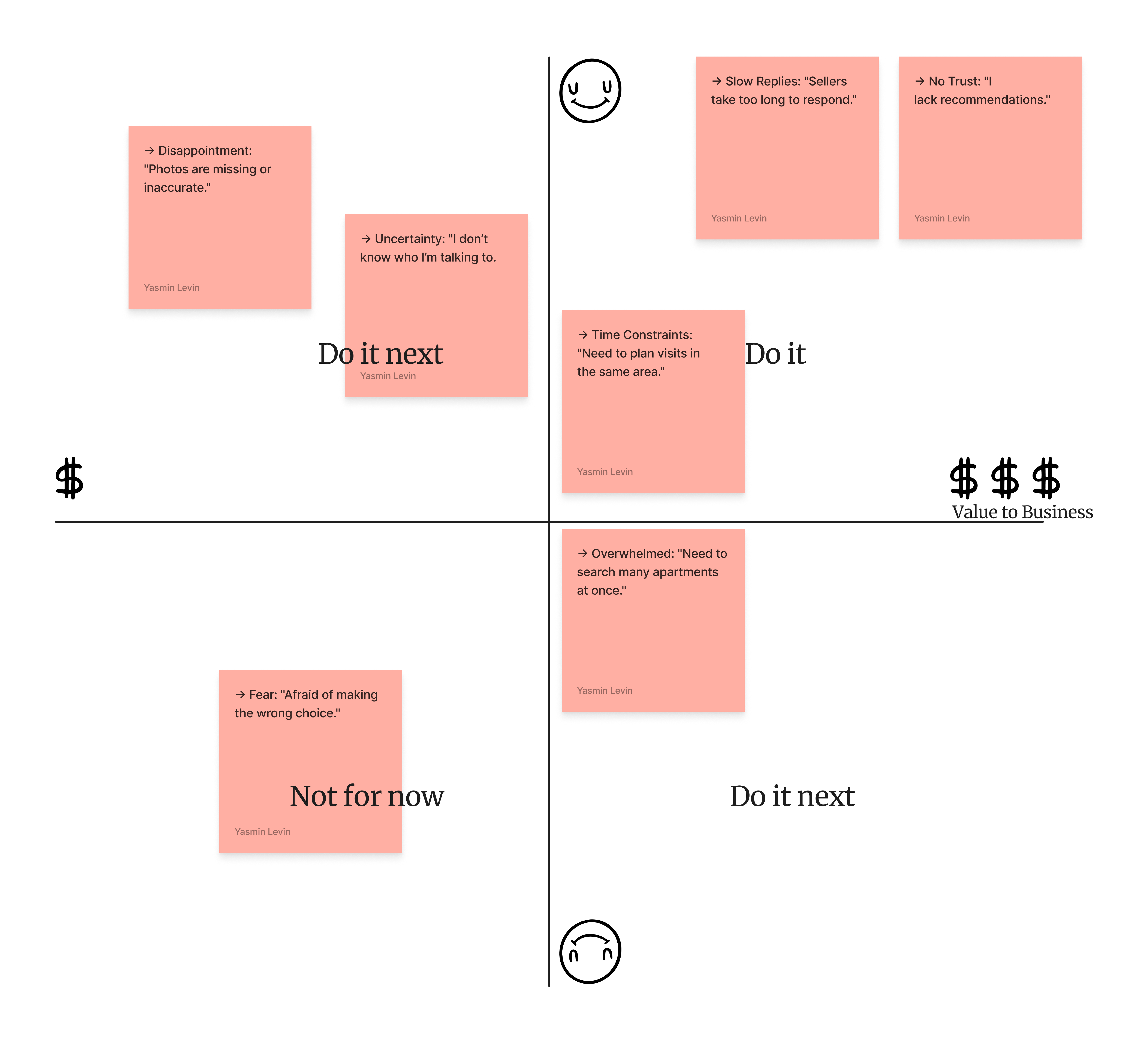
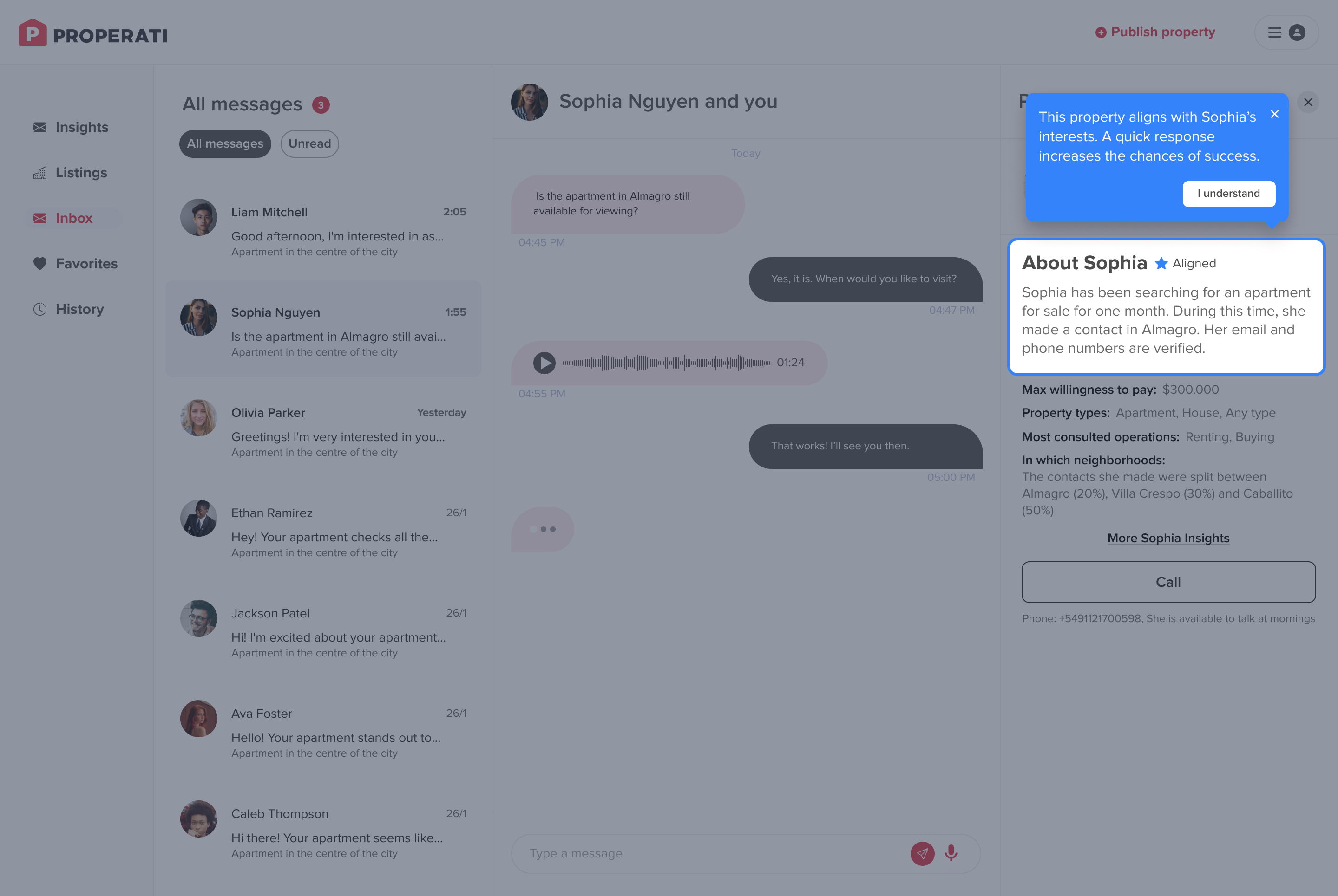
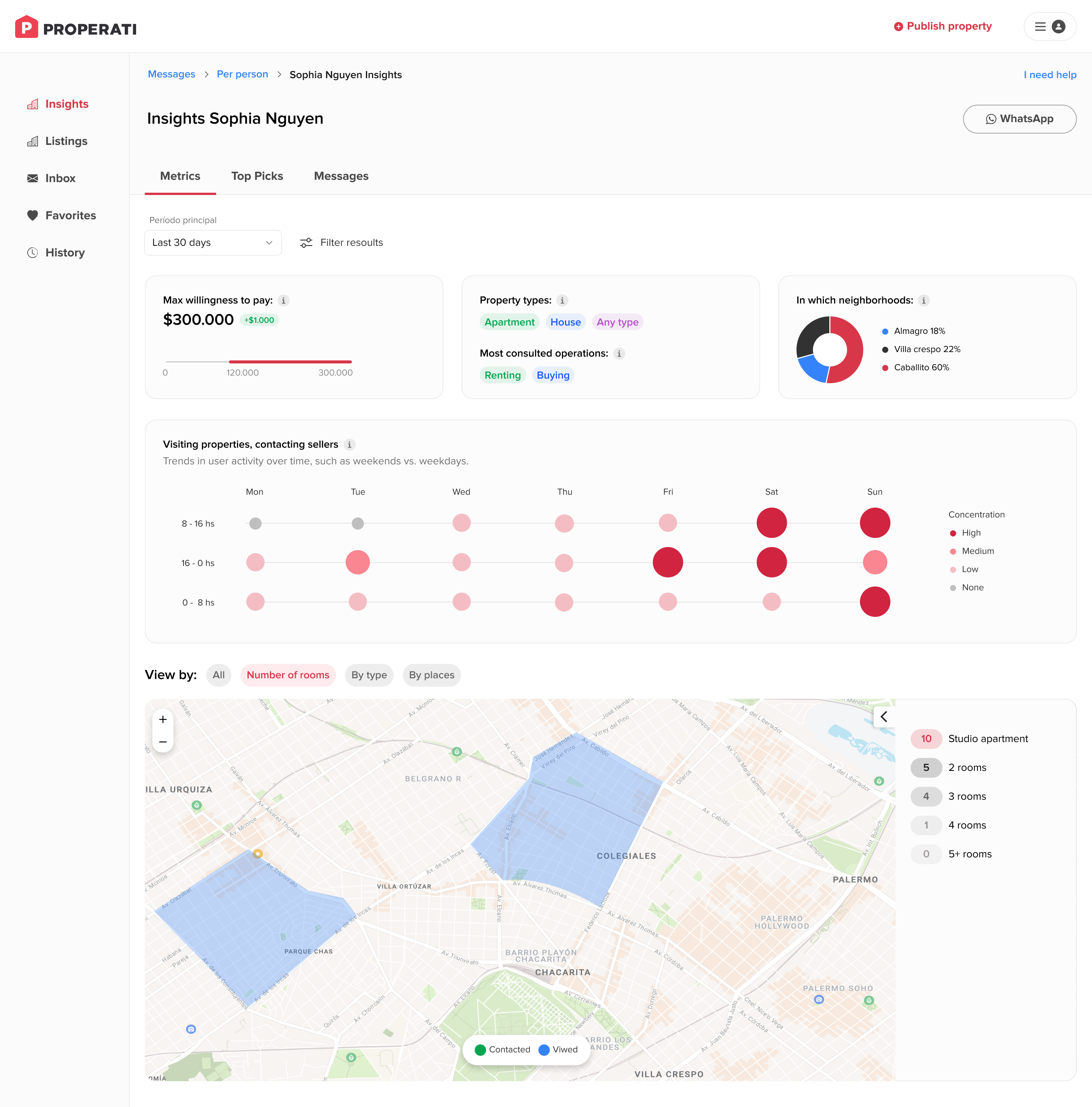
Concept Development
• Insight Integration
• Feature Prioritization
Stage 03 -
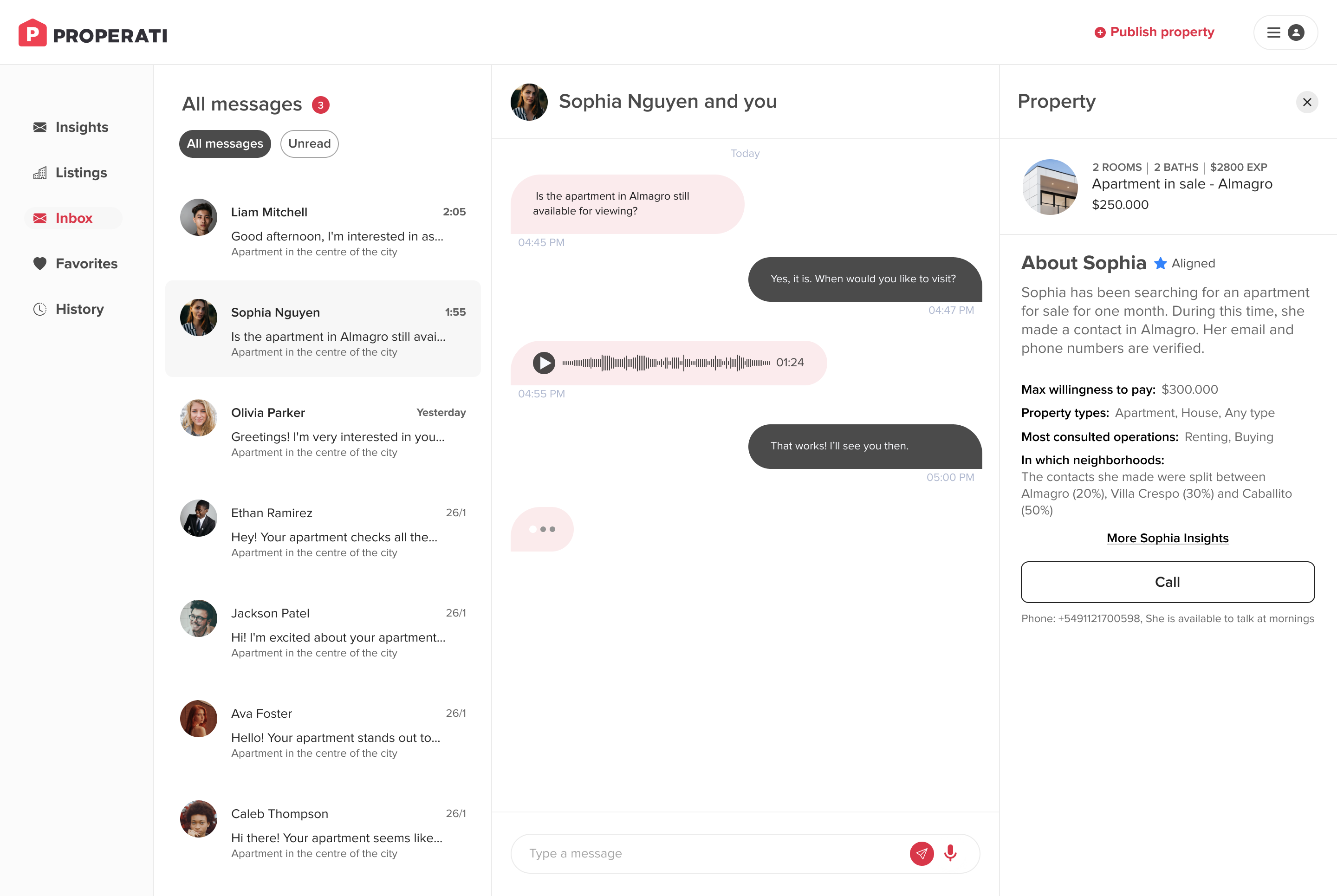
Design Execution
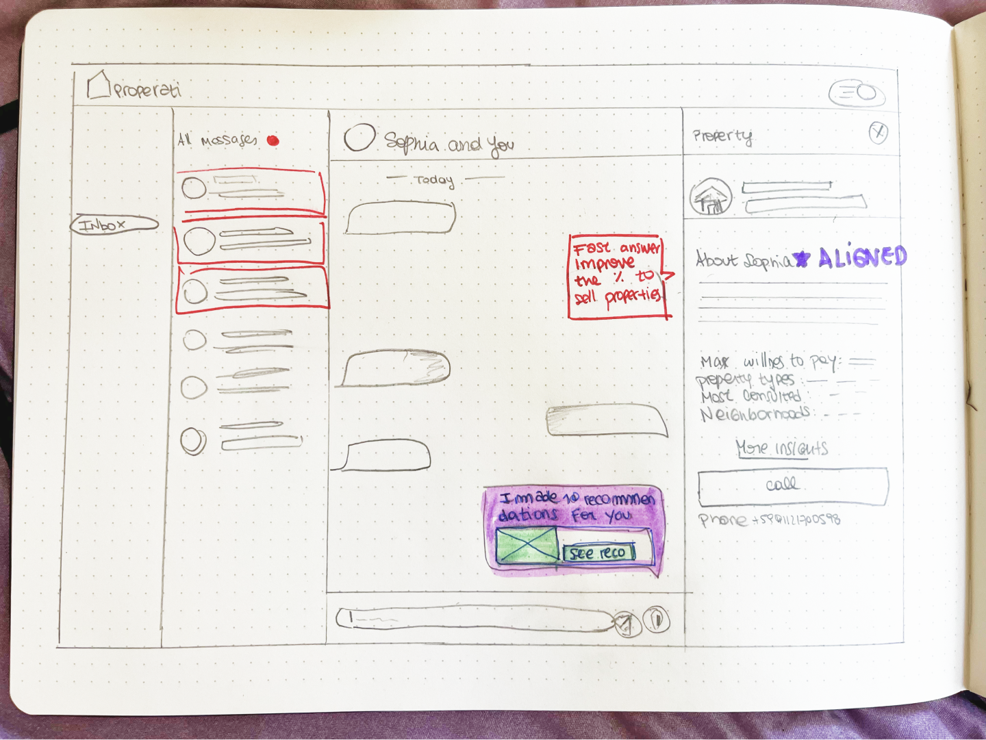
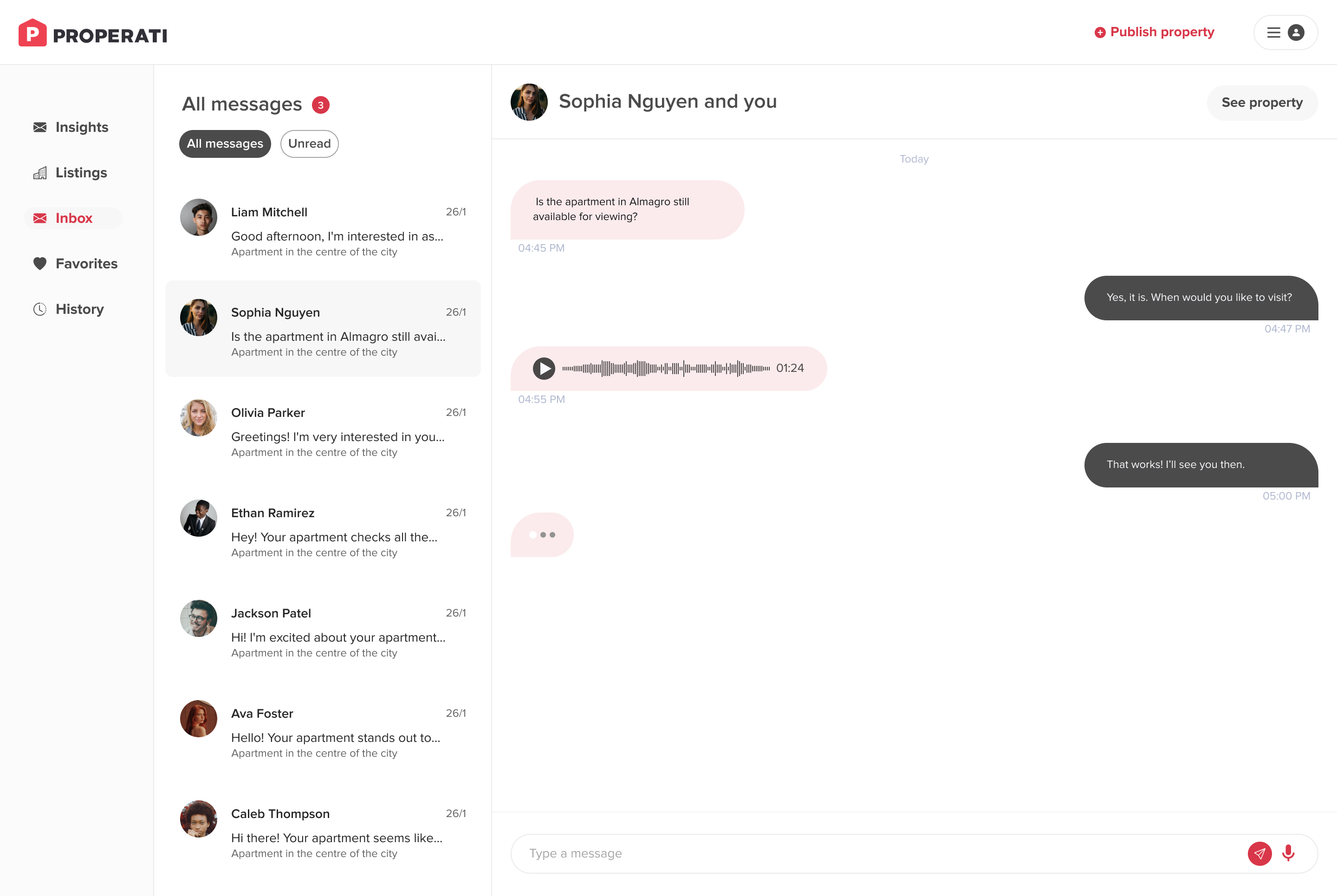
• Wireframing & Proto
• User Flow Design